Home > Surface Analysis Charts
Click here to jump to the latest charts.
Join our official Facebook group for updates and more! Connect with fellow weather enthusiasts today!
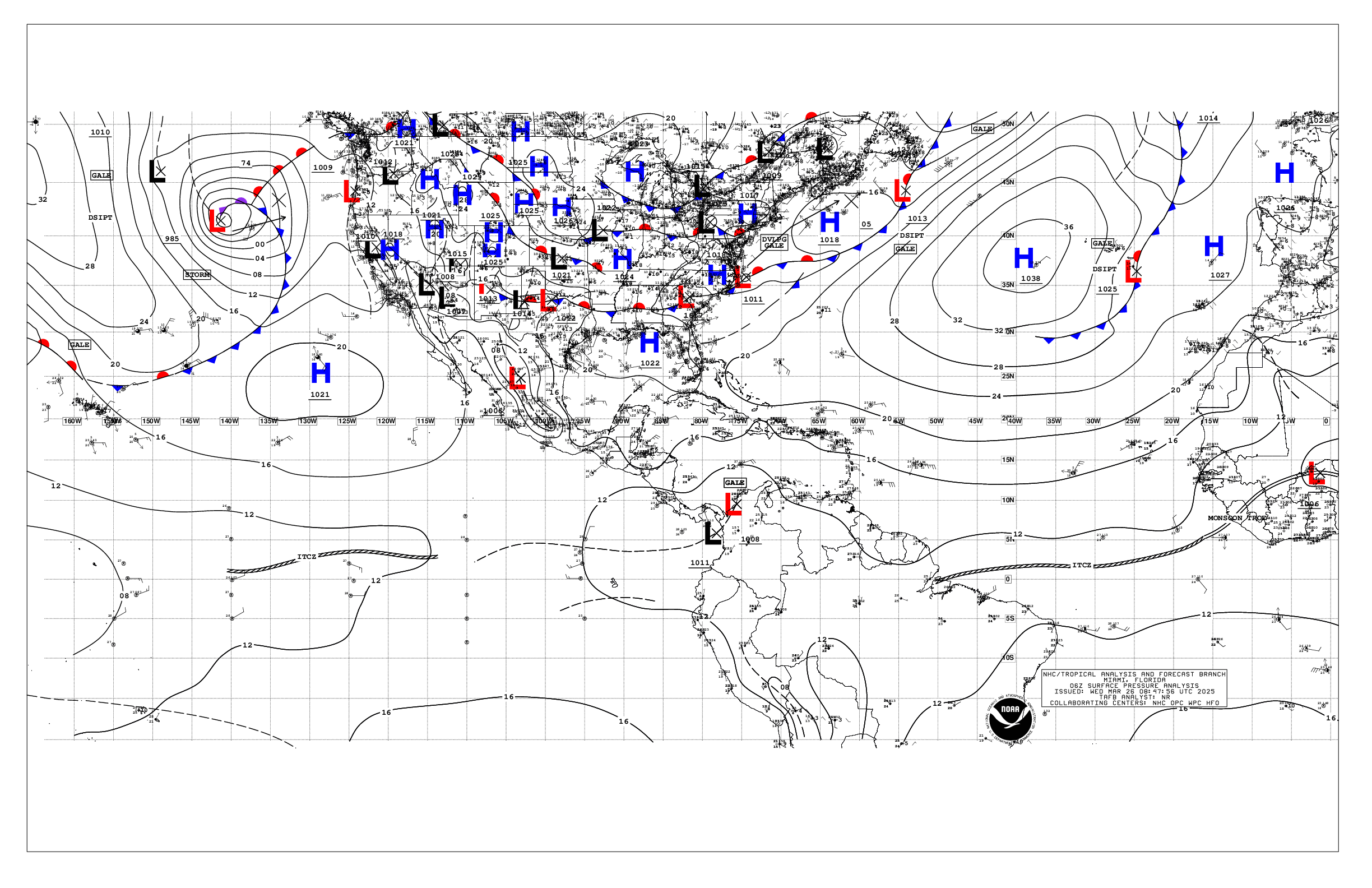
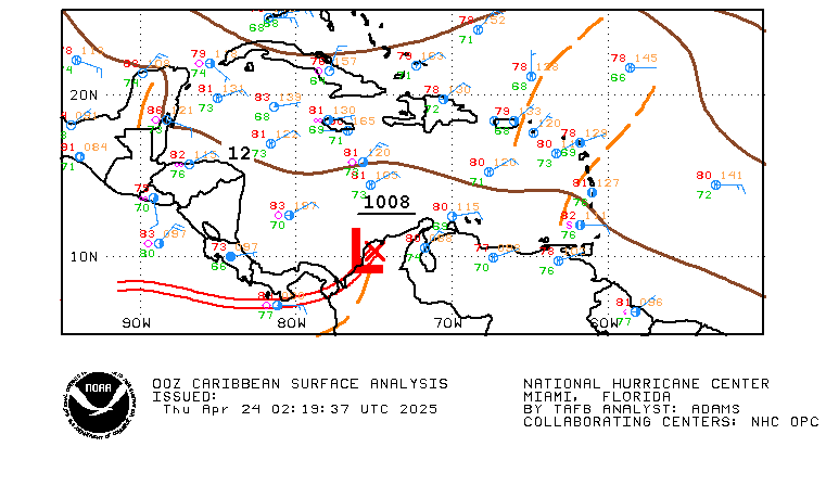
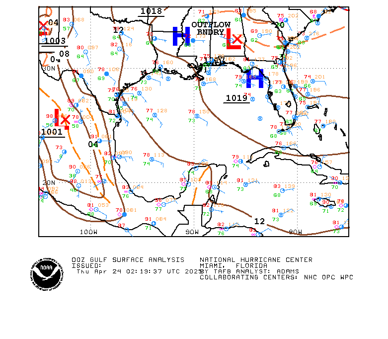
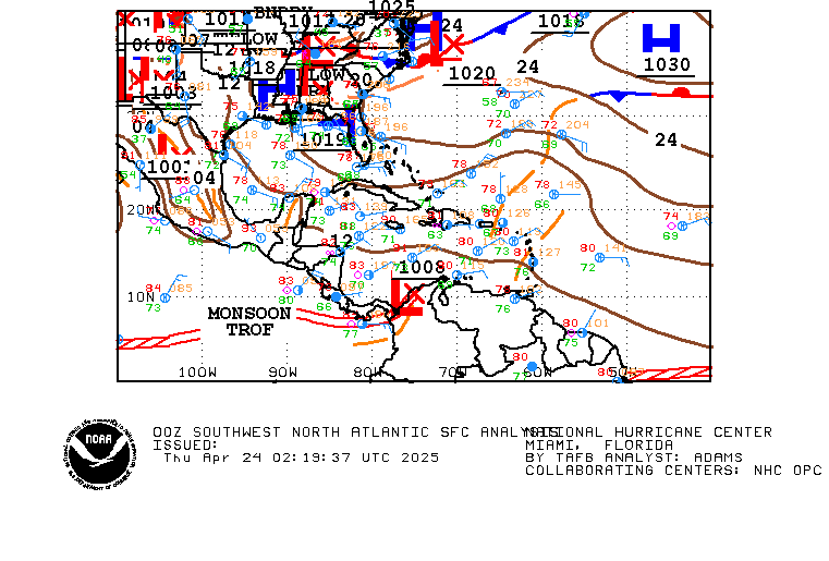
Surface Analysis charts are visual representations of weather conditions at the Earth's surface. These charts show atmospheric pressure patterns, fronts, and other weather systems on a two-dimensional map.
The charts use a combination of symbols, colors, and contour lines to represent different weather features. For example, high-pressure systems are often indicated by a large blue H, while low-pressure systems are represented by a red L. Other symbols might be used to show the location of cold fronts, warm fronts, or other weather features.
Surface Analysis charts can be used to understand current weather conditions and to make short-term weather forecasts. By analyzing the patterns and movements of pressure systems and fronts on the chart, meteorologists can make predictions about changes in temperature, precipitation, and wind direction.
These charts are commonly used by pilots, sailors, and other professionals who need to make decisions based on weather conditions. They are also useful for individuals who want to stay informed about weather conditions in their area.
Image source: National Hurricane Center.
Caribbean (Click Image to Enlarge)
Gulf of Mexico (Click Image to Enlarge)
Western Atlantic (Click Image to Enlarge)
Wide Area (Click Image to Enlarge)